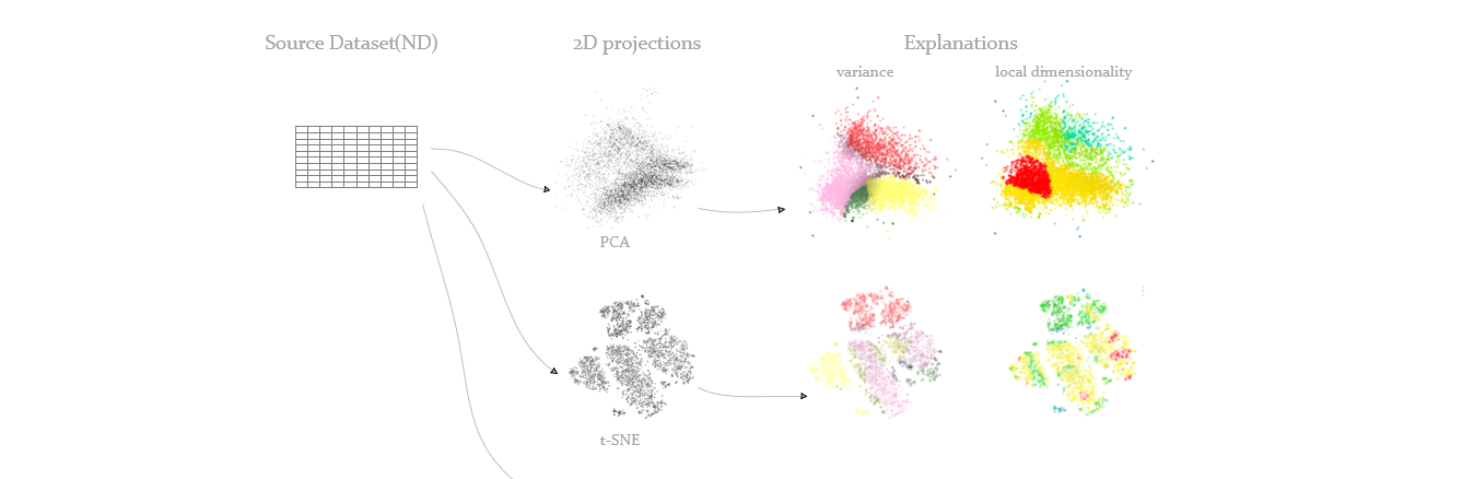
At the beginning, we need to know some basic knowleages, well, the multi-dimensional data or high-dimensional dataset are our research objects. And if we project the data from high dimension to low dimension, for example 2 or 3, then we can visualize them and have a direct visual understanding from it.
But AS YOU CAN SEE, with these projections, we can’t get what we want, it’s just some points with no meaning. It can be a very good one, with high quality, but what does it SHOW to us?
How do we know how the dimensions of the dataset relate to those clusters we see?
With only projections, we can’t. So, we need projection-explanations, basically they add information to the projection-scatterplot to help us read what we see in it.
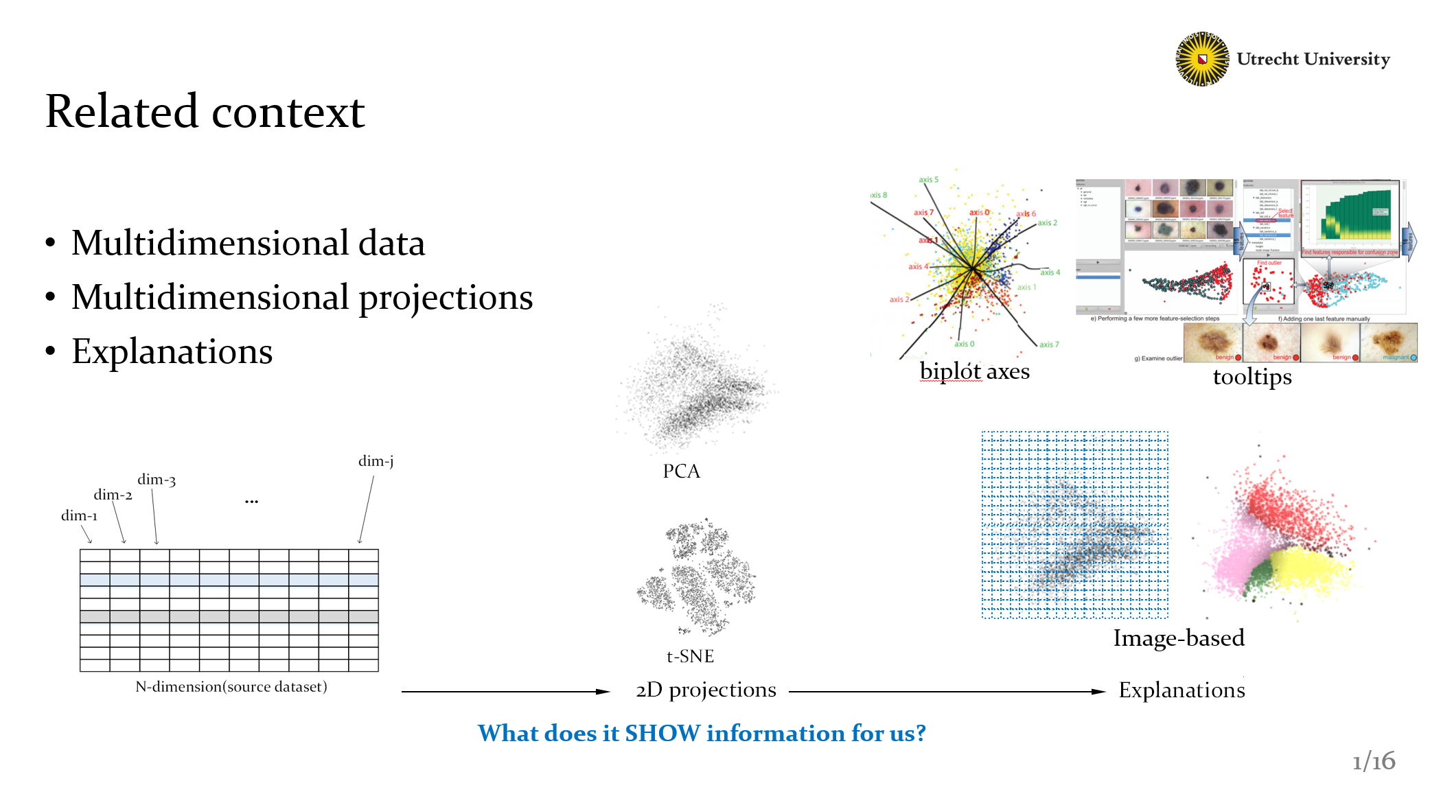
Well, there are many available methods ,like biplot axes, it provides a global explanations, meanwhile like tooltips methods, could provide local information but need more interactions. Here in order to get local explanations and not introduce too many interactions. we used a kind of image-based sulotion, we handle the projections as pixels view, and build a mechinasim to compute local dimensional information.
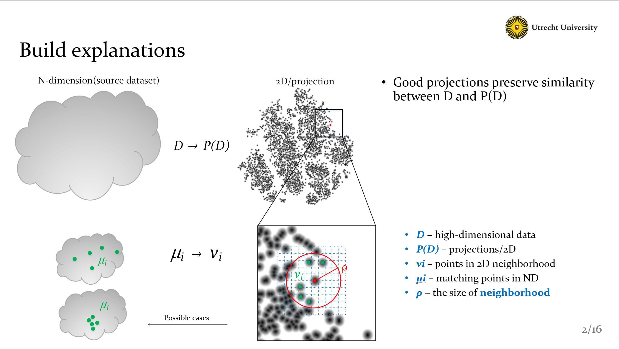
As you can see, the dimensionality reduction could be represented as D to P(D), P is actually the project method like PCA or t–SNE. Now we need to clearify our basic principle, that is
Good projections should preserve similarity between D and P(D).
Here we compute similarity by 2D neighborhood, points in the circle are called Vi, then we can find all matching points MIUi in high-dimensional data. Why do we do that? Because we know that projections should preserve neighborhoods. As you can see in the bottom-left figure, Obviously, the bottom case is better than the top one. It preserves neighborhoods.
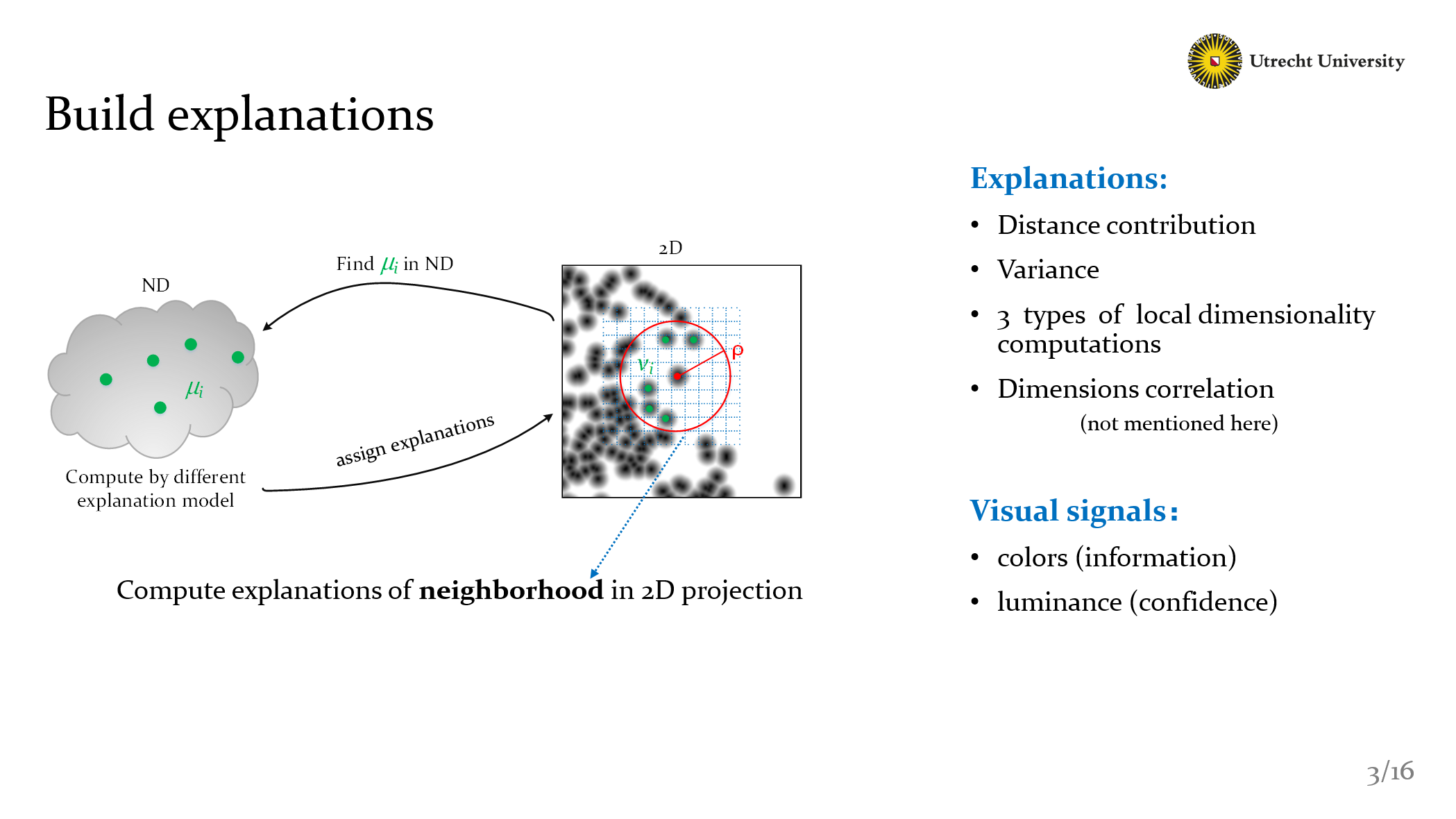
In Detail, after we get Vi and MIUi, we can use different model to compute the explanations. Here we create six methods, include fan.de.ril and dasilva’s methods.
- Distance contribution
- Variance
- 3 types of local dimensionality computations
- Dimensions correlation
And how we represent our result? It’s easy: We use colors to show the explanation and use luminance to show confidence. So what’s the confidence in out method?
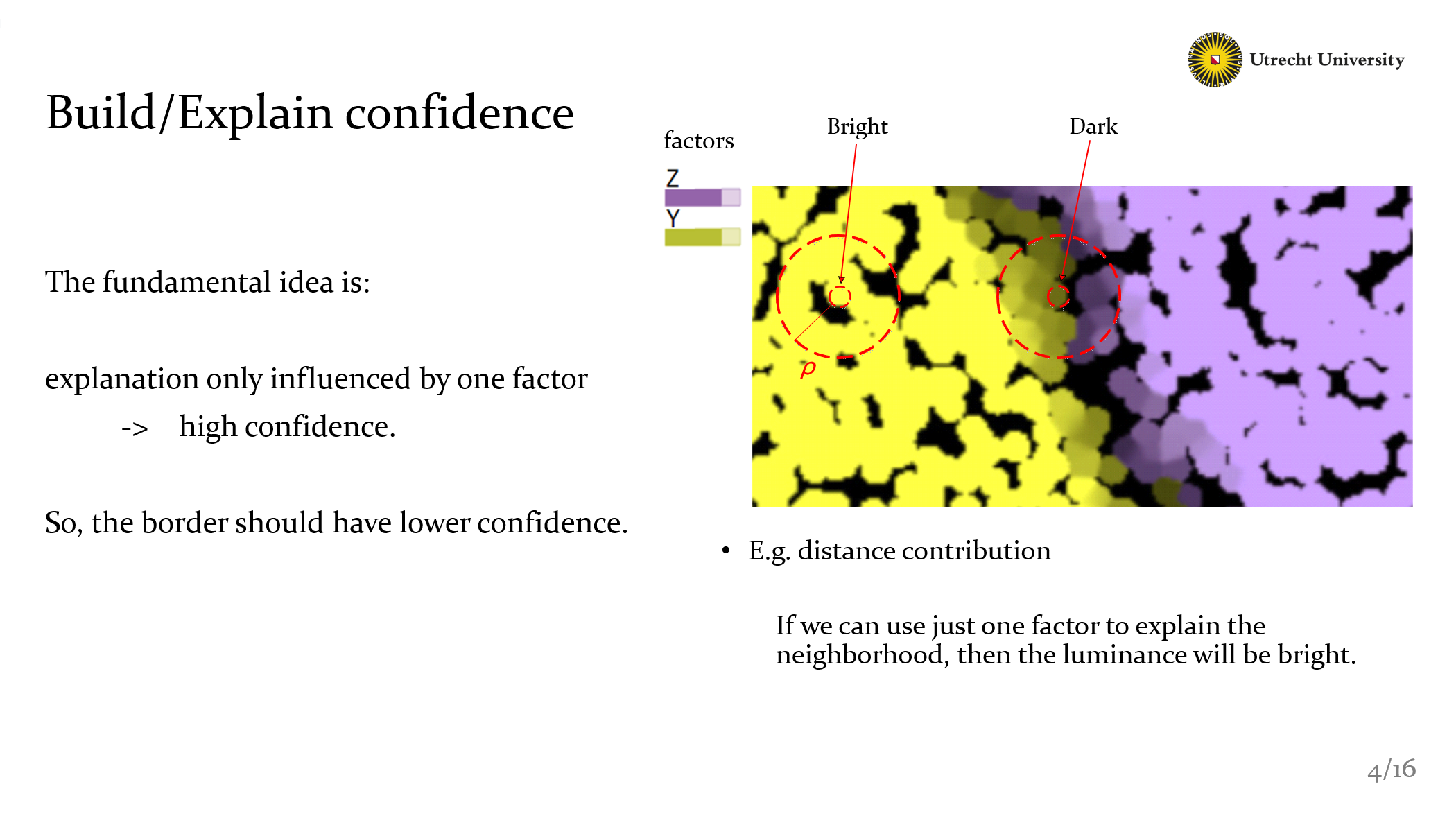
Ok, the fundamental idea is: If the explanation of one point that only influenced by one factor, Then the confidence should be high. On the contrary, like the border area, it should be dark. Because they’re influenced by different factors.
This is the basic idea, but of course, in different methods we created, we use different formula to achieve this design.
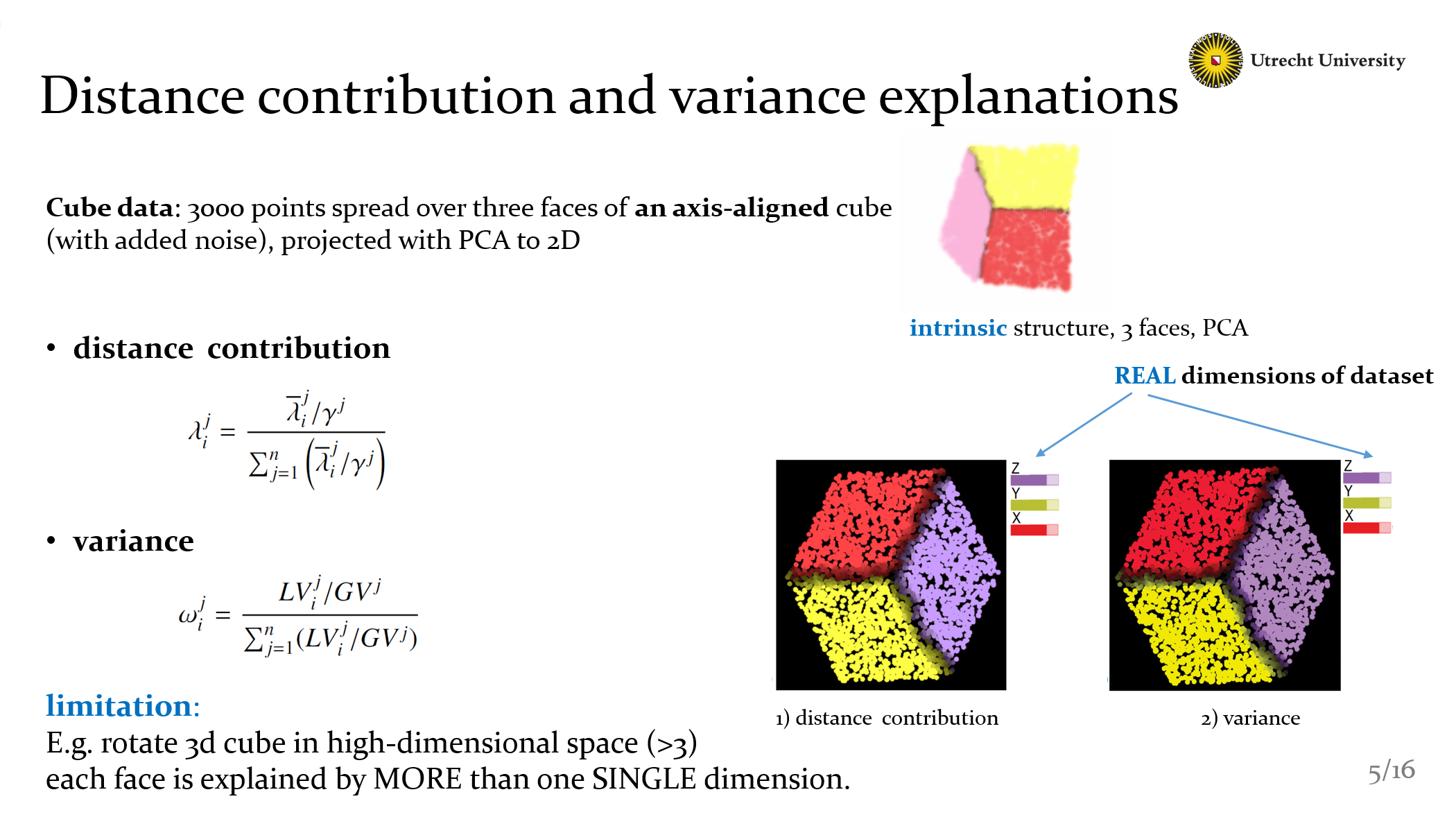
Now I’m going to show some details about our explanations methods. The dataset we use here is called Cube data: it has 3000 points, and they are axes-aligned and spread over 3 faces, the projections are generated by PCA. If we see the 3D projection, we can see the intrinsic structure more clear.
You can see The first two methods have similar result, because the formula we design is totally the same. The explanations here is bind with the REAL dimensions. Explained the most important real dimensions of each neighborhood.
But these two methods have a limitation: The cube here is axis-aligned. However, if that cube is rotated in that high-dimensional space, we won’t get such a clear explanation as we see in the figures here, because each face is explained by MORE than one SINGLE dimension. With this limitation, naturally we want to know how many dimensions we need when we compute our explanations.
<< Read more articles in https://www.cxmoe.com >>
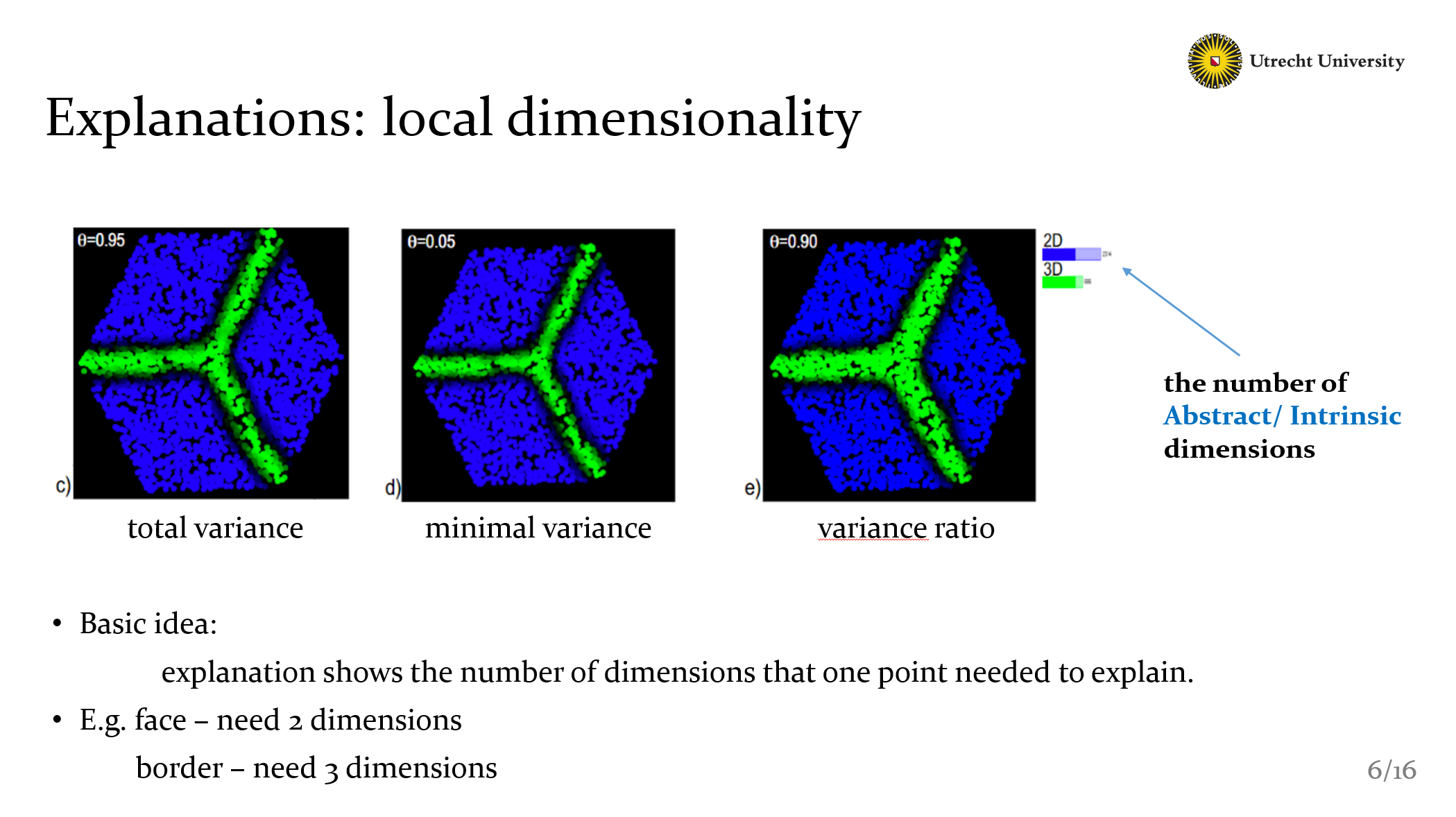
So we create the local dimensionality explanations. Here are 3 methods, but they have the same basic idea. To show how many dimensions we need to explain the projection. Well I need to Note that, the labels here are the number of Intrinsic dimensions, not the real dimensions.
That means if this cube has 100 dimensions(of course many noise inside), the 100 dimensions are its real attributes, we can find them in the dataset, but for each face, they just need just TWO dimensions to explain. This two dimensions are intrinsic dimensions, we can’t give them a name. It’s just a number.
So the fact is clear: the explanations here show that faces need 2 dims and borders need 3 dims. It’s easy to understand if we recall the 3D structure again.
Now As you can see, we have presented three kinds of explanations (distance, variance, and local dimensionality). They’re all based on 2D projections yet, but it could be extended to 3D projections with the same idea. It’s just technique problems. As I mentioned, they have limitations or just are extensions.
- So, actually, none of these single explanation is sufficient to understand a complex nD dataset,
- and there are some parameters that influence our explanations
So, we need to put these tools into the test. Trying to understand the structure of some complex projections. And, of course. testing the tools themselves, it brings us extra feedback on the limitations of the methods and also on what kinds of datasets are best explained by these methods. I’ll disscuss this part later.
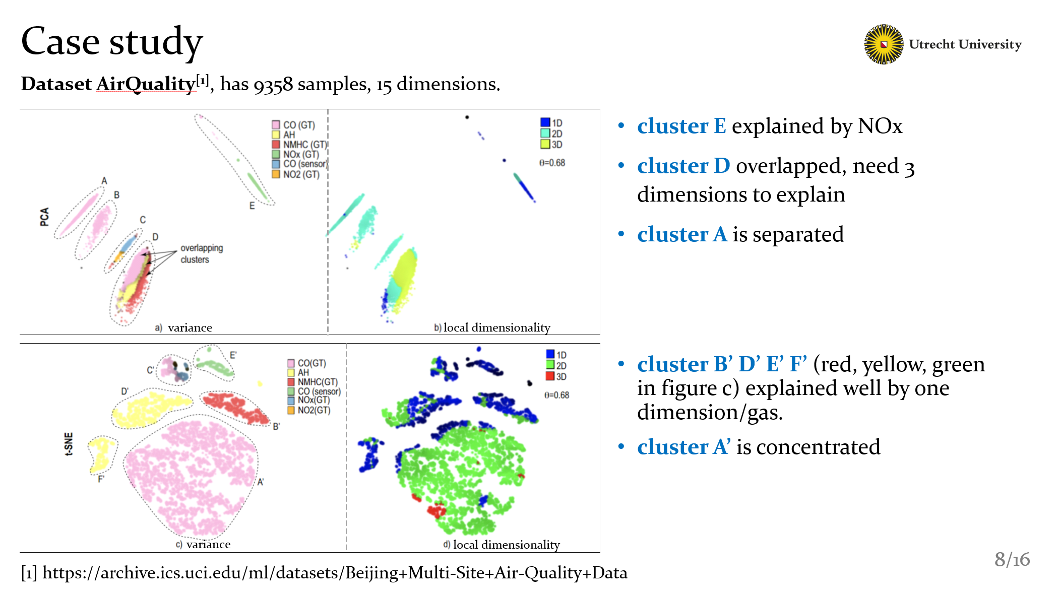
Well, so about the test, we test a big set of dataset, I’ll show you them later, here I’m going to use 2 case, to show how our explanations worked. The first dataset is called AirQuality, it has about ten thousands samples and fifteen dimensions. The dimensions are some value of different gas in the air that gathered by sensors. Indicate the quality of air.
As you can see, there are 2 kinds of projections: PCA in the top and t-SNE in the bottom. And each of them we use variance and local dimensionality to explan.
Recall the usage of our explanations. In PCA projection, it’s clear that cluster E explained by Nox. Because in the local dimensionality view cluster E just need one dimension to explain. That is Nox.
With the same idea we can know that in t-SNE projection, the yellow red and green part could be explained by one dimension or 1 gas here respectively.
Besides, for cluster D, with these 2 explanations of PCA, it’s clear that D needs 3 dimensions to explain, they’re 3 gas, CO NH and NMHC. Actually it’s a kind of overlapping.
Finally we can see the cluster A, pink area, is separated in PCA projections. Meanwhile in t-SNE projections, it concentrated in just one single area.
So, in conclusion we can have good a understanding by using these two explanations. Futhermore it also indicate that for this dataset, t-SNE is performed better than PCA. But… if it’s enough for all cases? Ofcourse not, I’ll give you another example to show that what can we get from 3D projections.
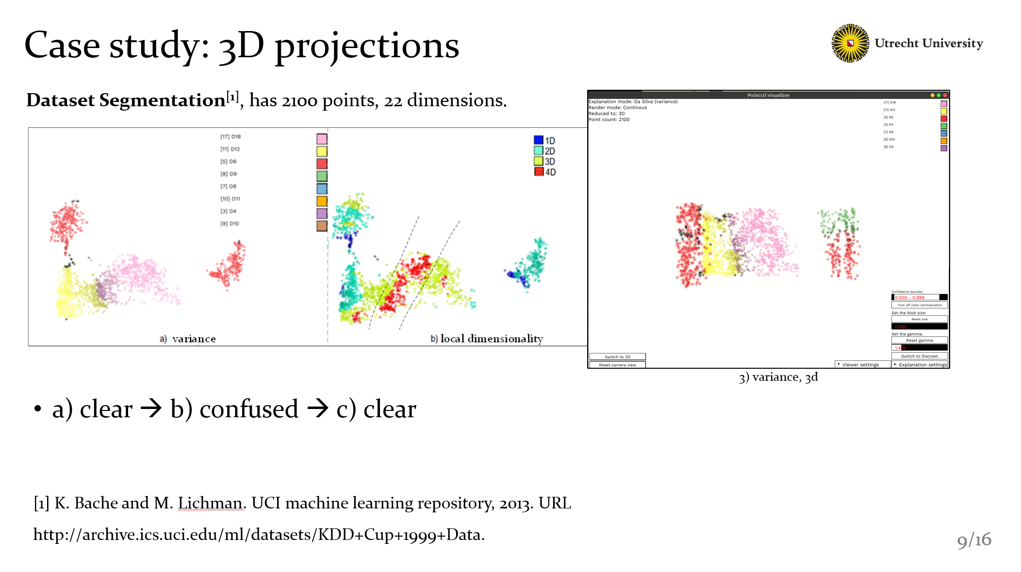
In this case, we use segementation dataset, it has 2100 points, 22 dimensions
As you can see, with variance explanation, it seems not bad, but with figure b, we know that they have more insight dimensions not showed in a). Especially the pink area, it includes a strange high-dimensional banded area. Well, with the two view, we can’t get more information. But here we have 3D explanations, and everything becomes clear. Now we know:
- the high-dimentional area in figure b is actually the border of yellow and pink part in c.
- and also, in figure c, we find that the right group shows with green and red, actually is not perfect explained as shown in figure a.
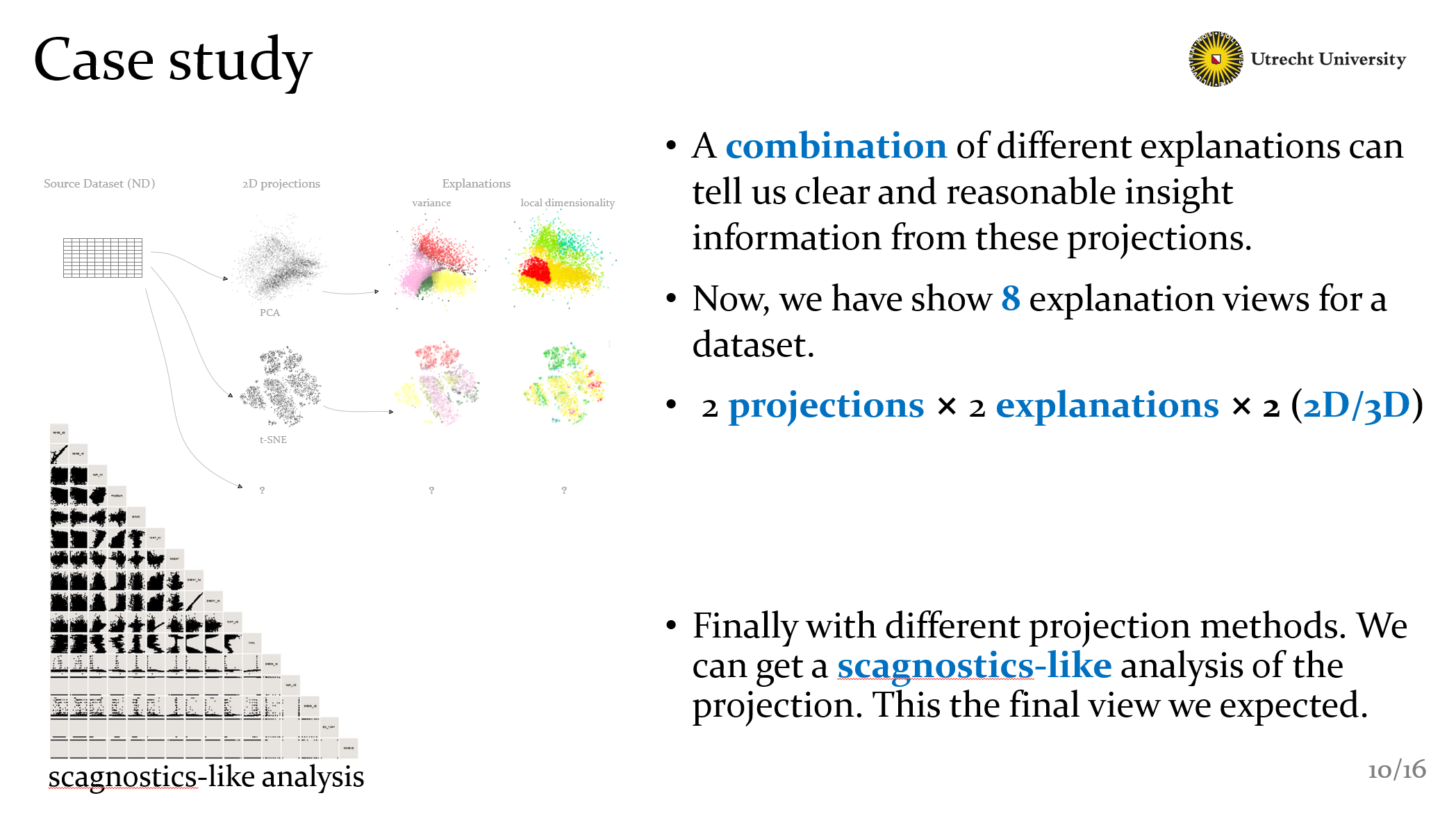
Yet I’ve show something that the combination of different explanations can tell us clear and reasonable insight information from these projections.
Now, we have 8 explanation views for one dataset. We test 2 project method, pca and t-sne; 2 kinds of explanations, and 2D 3D projections.
That’s all we have now in this slides, Of course we want to compute more explanation views. And with these views. We can make a scagnostics-like analysis of the projection. This is the final view we expected.
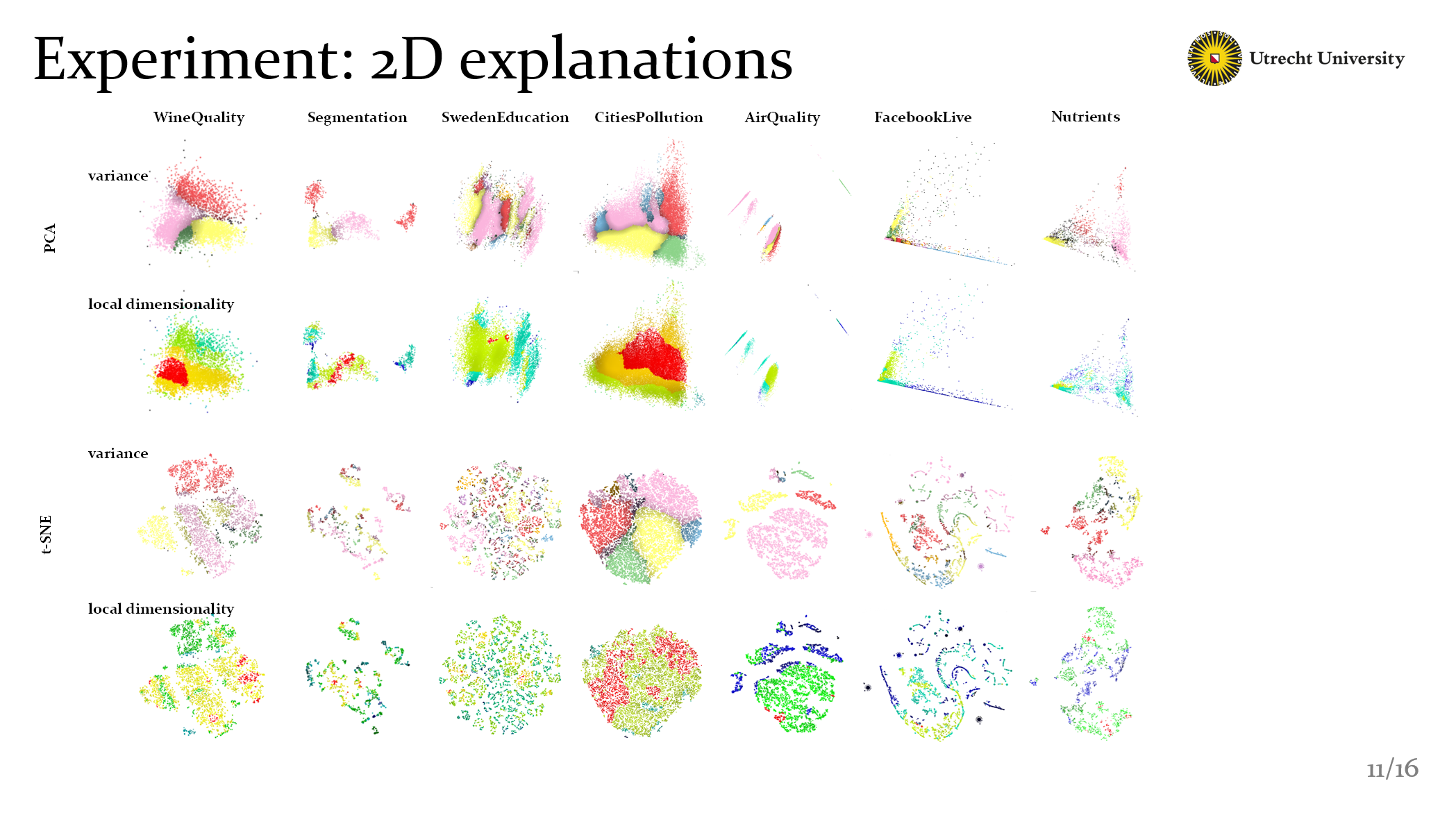
Ok, after the two specific cases, I’ve mentioned that we also test a large set of dataset. Include 2D projections and 3D projections. You can find all the results in the googledrive if you want to check.
Of course if you have suitable dataset, welcome to let us know, and let us show you some explanations by our methods. Well What I want to emphize here is that these results are already the good one, we can’t say it’s best but it’s good, we find them manually.
This is related to the discussion part.
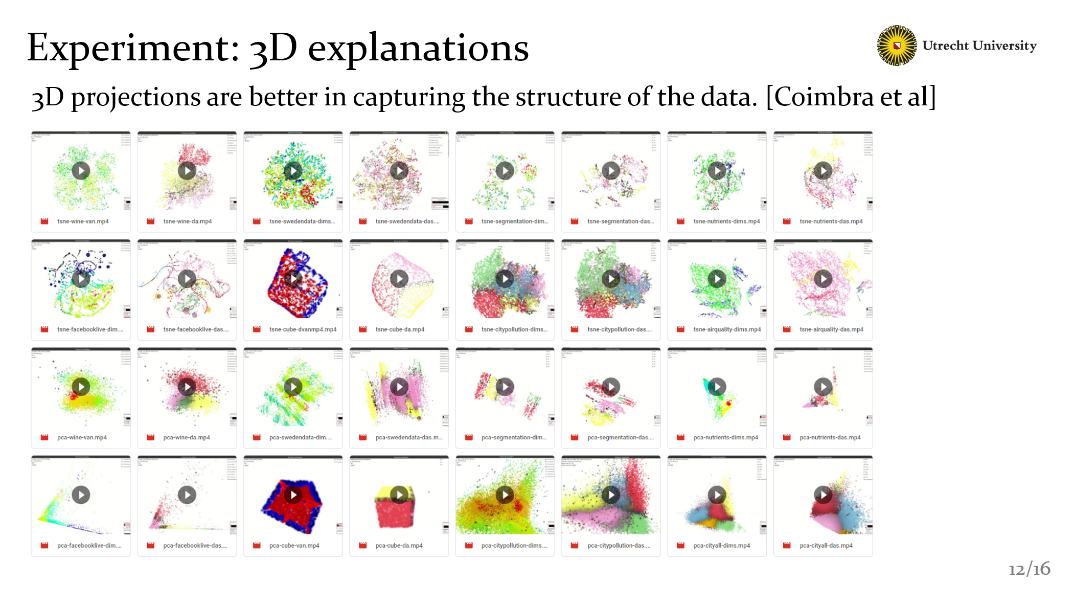
And these are 3D explanations we have. We know that 2D projections are used more frequently in information visualization, but of course we can use 3D projections. And it has been shown that 3D projections are better in catching the structure of the data, becuse, we have one extra dimension to project into!
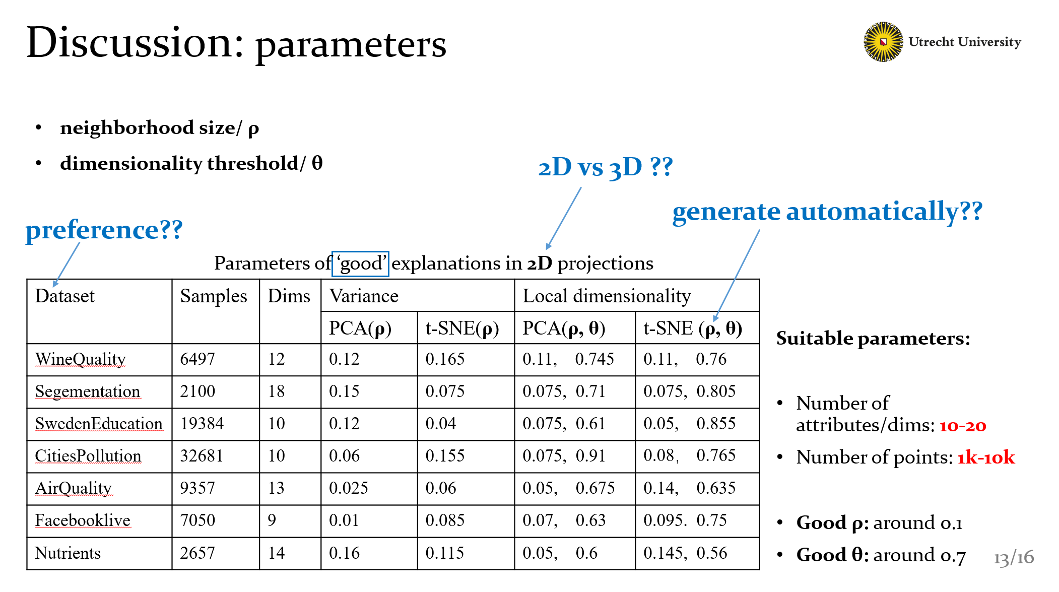
Well the table here shows parameters of good explanations in 2D projections. Of course we can get a rough good value with this. But actually this table could be extended larger with other project methods and other explanations. And we can get more questions from here.
- what’s the data preference of our methods ?
- How about 3D explanations compared with 2D ?
- And as I mentioned these value are founded manually, can we get them automatally?
- These questions are actually our next works.
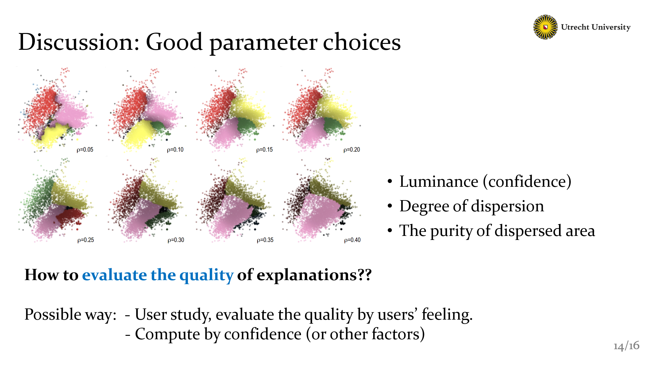
Ok, then we also discussed with parameter choices. here, we still could find good one in these explanations, but for single one, we have no measure way to know if it’s good or bad. How to evaluate the quality of explanations?? We could make a user study, or we could try to compute the quality by confidence or degree of dispersion.
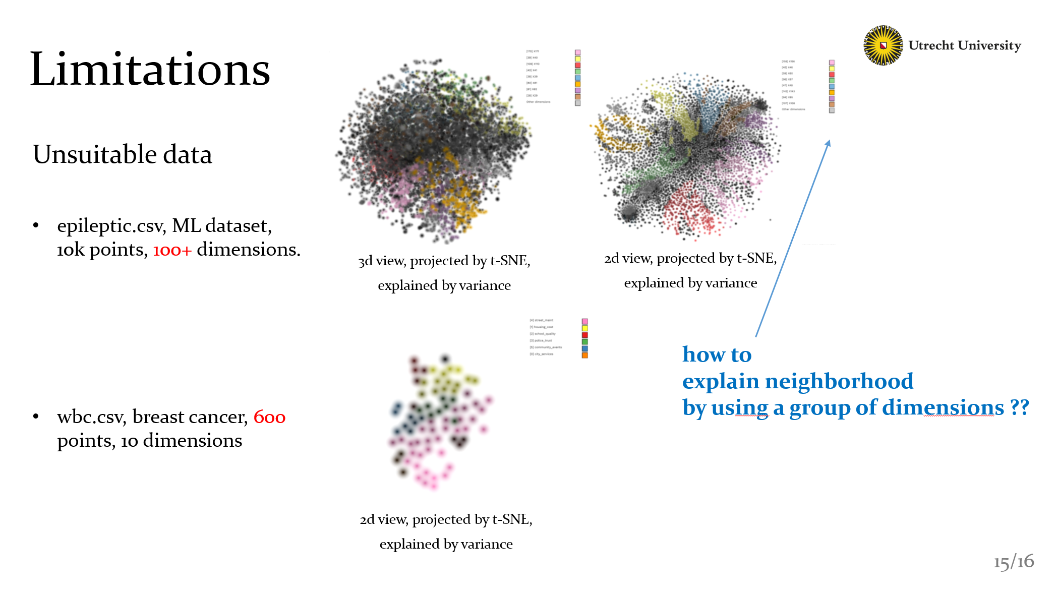
Well finally there still some limitations. as you can see, there are some bad cases. If there are too few points: our explanations cant work well, the methods require to have dense neighborhoods to compute some meaningful explanation. If there are too many dimensions: for most neighborhoods, we can’t select a single dimensions to explain the data. So it shows the default black color. This also lead to a question: Can we explain neighborhood by using a group of dimensions ??
THANKS & END
Comments